CAMILLE DEV LOGS: DESIGNING THE BLOOD DEMON
Table of Contents
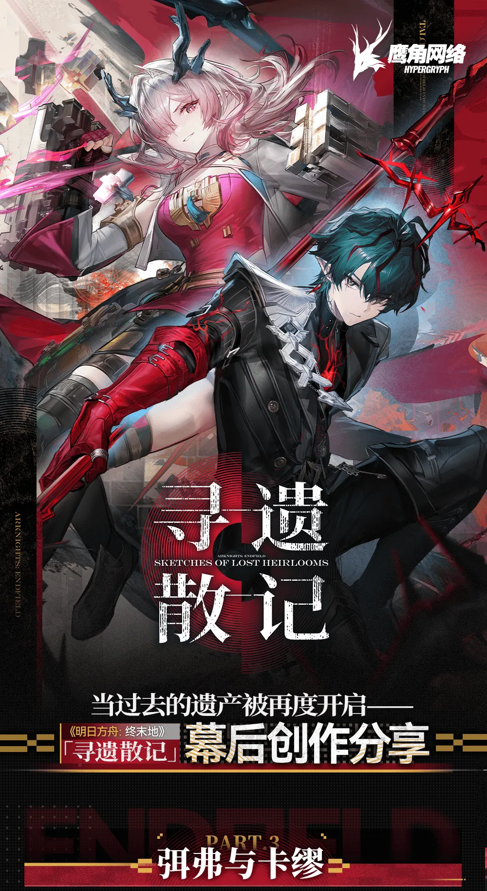
Hypergryph just pulled back the curtain on how Camille was built. The third installment of their “Sketches of Lost Heirlooms” behind-the-scenes series is a long Q&A with the art, modeling, animation, and narrative teams, walking through every deliberate choice that turned a one-line copywriter pitch into the Blood Hunter you pulled in 1.3.
If you only know Camille through his banner math (the Heat vanguard kit, the SP battery role, the Blood Hunter deep dive), these logs are the other half of the character: why he stands the way he stands, why his eyes flick red, why he has wings at all, and the quiet flower-blooming Easter egg most players walked right past. Here is everything the dev logs confirm, organized and put in context, with the parts that connect back to his story quest flagged as we go.
A naming note up front: the original logs romanize his name as Camus and his faction’s patron as Seš’qa / Seshka. The English client localizes him as Camille, and that is what we use throughout. The character the devs call “Philip” is the same brother our story-quest breakdown identifies as Char Arno.
Camille’s logs are Part 3 of a longer series. If you want the Contingency Contract design philosophy and the boxed-map framework from Parts 1 and 2, along with Mi Fu’s own concept-art and cutscene notes, our Sketches of Lost Heirlooms Development Insights roundup covers the rest of the series.
TL;DR - Key Points
- The pitch was one image. A copywriter handed the team “Blood Demon Guardian”: a slender black figure in the dark, fire bats fluttering, raising a spear of congealed blood to declare death to his prey. Every visual grew from that single scene.
- The costume fuses two ideas. Aristocratic “Blood Demon” elegance plus an “agent”-like Guardian silhouette, all rendered in modern Seš’qa fashion, with exactly one classical element: the key at his waist.
- The wings were not in the original plan. Camille was conceived wingless; the “Bloodwing” was a mid-production call made because the team agreed it would help combat readability. They are described as the first wings the project ever built.
- The neck marks are lore, not decoration. The thorn crown and throat pattern are shaped on a Mobius angle and read as sorcery marks bestowed by Seš’qa on its caretaker, framed as “both honor and curse.”
- The red eyes are a feature, not a flourish. A trial “Switch Blood Eyes” effect flips his restrained dark-green stare to dangerous crimson, reused across his entrance, ultimate, and story scenes.
- The narrative reframed him as a brother. Early drafts had Camille simply “chasing” his sibling; the shipped version makes him experience the story as an older brother, not just Seš’qa’s caretaker.
- There is a blossoming-vines Easter egg. The iron frame Camille first sits on has bare vines; return after the story and the vines have flowered, mirroring his arc with the Endministrator.
What “Sketches of Lost Heirlooms” actually is
Before digging in, it helps to know what you are reading. “Sketches of Lost Heirlooms” is Hypergryph’s recurring developer-diary series, and this is Part 3, subtitled for the Mi Fu and Camille pairing. The format is a hosted interview: a moderator asks the production teams a question, and the modeling, animation, special-effects, and narrative leads answer in turn.
The Camille section runs across the character-planning, 3D-production, and narrative phases. It is unusually candid about decisions that got reversed mid-project, which is the most useful kind of dev diary, because it shows you the tradeoffs rather than a tidy after-the-fact justification.
The brief: “Blood Demon Guardian”
Every part of Camille traces back to one sentence from the copywriter: the concept of a “Blood Demon Guardian.” The team’s own description of the seed image is worth quoting in spirit, because it reads like a key-art prompt: in the darkness, a slender black figure passes by, fire bats fluttering around him; he raises a spear made of congealed blood and declares final death to his prey.
That scene became the literal starting point for concept art. It is a tidy demonstration of how Endfield’s pipeline works in practice: writing hands the art team a mood and a silhouette, not a stat sheet, and the visual identity is reverse-engineered from that mood. Once you know the brief, the finished character stops looking like a pile of cool details and starts looking like a single argument: predator, in a suit, in the dark.
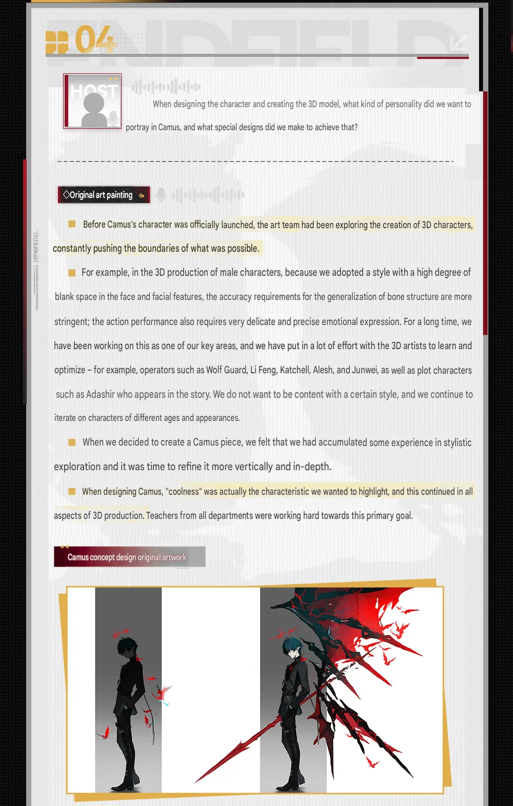
The early “original art painting” exploration, before the wings were ever on the table.
Reading the costume: aristocrat meets agent
The clothing brief is where the two halves of “Blood Demon Guardian” get split apart and recombined. The team wanted the aristocratic air of the “Blood Demon” to collide with the agent-like feel of the “Guardian.” That is why the suit, the belts, the silver ornaments, and the leg armor all read as modern fashion rather than gothic costume, which is also how they signal the “eerie elegance and cutting-edge style” of the Seš’qa faction.
The single most telling detail is what they left out of that modernity. The only classical element on the entire outfit is the key at his waist. The designers call that contrast deliberately “story-driven,” and it is: in a silhouette engineered to look contemporary and lethal, one old-world object is allowed to survive, and your eye is meant to snag on it. For a character defined by a relationship to his past, a single antique key doing all the historical heavy lifting is an elegant piece of costume writing.
| Design element | What the dev logs say it means |
|---|---|
| Modern suit, belts, silver, leg armor | “Agent” Guardian half; Seš’qa faction’s cutting-edge style |
| Aristocratic styling | “Blood Demon” half; eerie elegance |
| The key at the waist | The lone classical element, deliberately story-driven contrast |
| Thorn blood crown + throat marks | Sorcery marks bestowed by Seš’qa; “honor and curse” |
| Torn back / scar | Exposes the caretaker’s “sensitive and vulnerable side” |
The blood crown and the marks on his throat
The thorn-shaped blood crown and the pattern wrapping his neck are the parts most likely to get filed under “edgy decoration.” The logs insist otherwise. The team specifically asked the model and motion designers to set the blood crown to a Mobius-strip angle in the character-development interface, and the neck pattern repeats that Mobius shape combined with a spearhead graphic, so the marking reads as a thorn wrapped around his throat.
The intended reading is suffocation and inevitability: a “dangerous, suffocating, and inescapable fate.” More importantly for lore hunters, the paired neck patterns are described as unique sorcery marks bestowed by Seš’qa upon its caretaker, framed as “both honor and curse.” That is a real lore beat smuggled into a costume note. It tells you Camille’s relationship to Seš’qa is contractual and double-edged, which lines up with how the Danse Macabre title frames him as bound to something larger than himself.
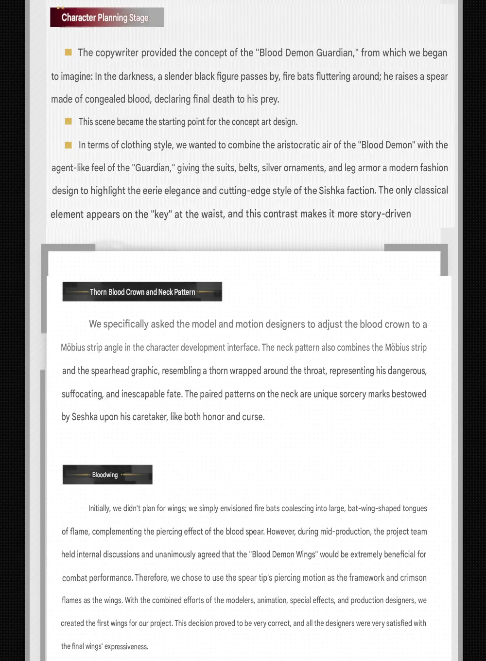
The planning-stage notes lay out the “Blood Demon Guardian” brief, the thorn crown, and the first hints of the Bloodwing.
Bloodwing: the wings that almost did not exist
This is the headline reversal in the whole document. Camille was not originally designed with wings. The early plan was simpler: fire bats coalescing into large, bat-wing-shaped tongues of flame, there to complement the piercing effect of the blood spear rather than to be a feature in their own right.
The change came mid-production. The project team held internal discussions and unanimously agreed that proper “Blood Demon Wings” would be a real benefit to combat performance, presumably for readability and silhouette during his flashier attacks. So they kept the spear tip’s piercing motion as the structural framework and built crimson flame as the wing membrane. The modelers, animators, special-effects artists, and production designers all collaborated on it, and the logs note this was the first set of wings the project had ever made.
That detail matters beyond Camille. It means his kit doubled as R&D for a new visual subsystem, and “first wings in the project” is the kind of internal milestone that tends to get reused. If you are wondering whether future operators will lean on similar flame-wing effects, the dev logs are quietly telling you the tech now exists.
Why the reversal is worth noting
Plenty of dev diaries only show you the polished final answer. This one shows the team explicitly changing course because a wingless design did not serve combat. It is a useful reminder that Endfield’s character art is downstream of gameplay needs, not purely an illustration exercise.
The scar: tearing open the wound
The back of the suit went through a lot of iterations. The team kept trying decorative cuts and kept landing on something that “always lacked a sense of indispensability,” which is a very honest way of saying the back looked busy but not meaningful.
The fix arrived once the wings were locked in. They decided to literally tear open his wound, using scarlet blood crystals to expose what the logs call the caretaker’s “sensitive and vulnerable side,” and the model and effects artists built dedicated material work so the scar reads as a real injury worn into the uniform rather than a print. It is the same principle as the key: in a character built around control and coolness, the one place the armor breaks is where his vulnerability is allowed to show. Design and characterization doing the same job.
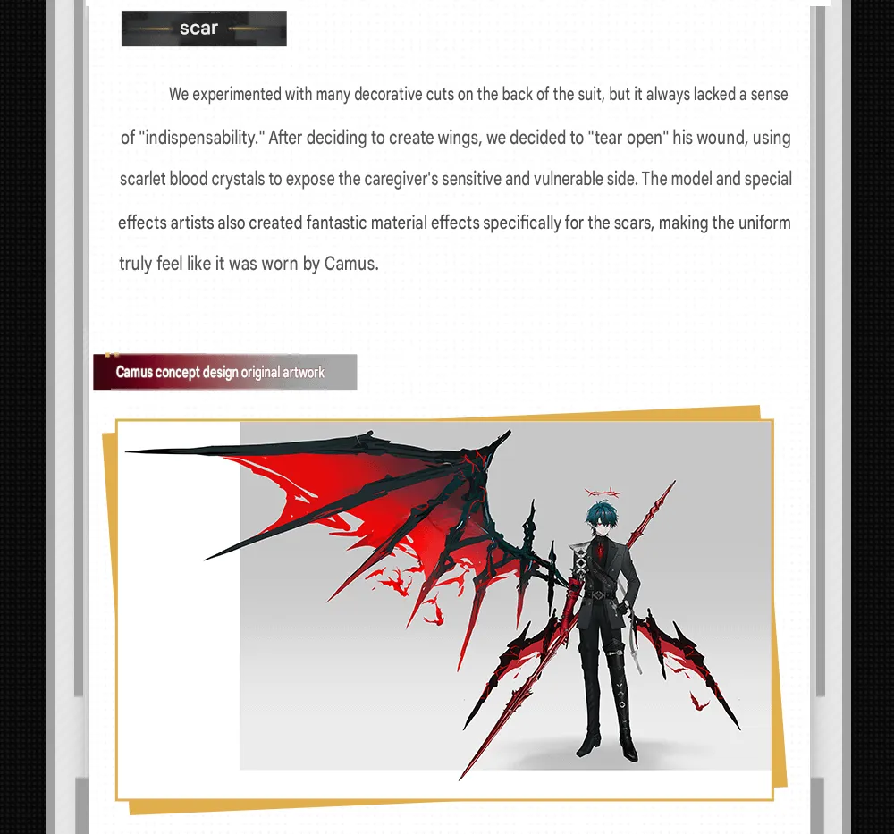
The locked concept: the spear-framed Bloodwing and the torn-open scar that exposes the blood crystals beneath.
The animation language: pockets, face-covering, and blood eyes
The 3D-production section is where Camille’s “coolness” thesis gets the most attention, because animation is where a still concept either reads as cool or reads as stiff. Three signature gestures carry the load.
The hand-in-pocket pose was locked from the initial design phase to convey an elegant, aloof, unapproachable demeanor. It caused a genuine technical headache: the original “suit plus belt” made it hard to smoothly lift the jacket and slide a hand into the pocket. The fix was to add openings on the sides and reposition the trouser pockets to match the arm posture, which also further shaped his physique. The team admits they worried overuse would make it look like his “hands were glued to his pockets,” and credit the motion and effects designers with selling it as style instead.
The face-covering action shows up in three different places (the UI entrance animation, the ultimate skill, and story scenes) and the team notes it was a coincidence that everyone independently reached for the same gesture. The interpretation shifts by context, which is the clever part.
| Where it appears | Emotional read |
|---|---|
| UI entrance animation | Mysterious and restrained |
| Ultimate skill | Oppressive and suffocating |
| Story presentation | Uncontrolled anger |
The “Switch Blood Eyes” effect started as a trial. His default dark-green eyes are deep and restrained; the team tested flipping them to red and found the crimson added a dangerous tension, “as if staring at prey,” matching the original Blood Demon brief perfectly. It worked so well in the entrance animation that they rolled it out to other performances. Next time his eyes go red in a cutscene, that is the brief paying off, not a render glitch.
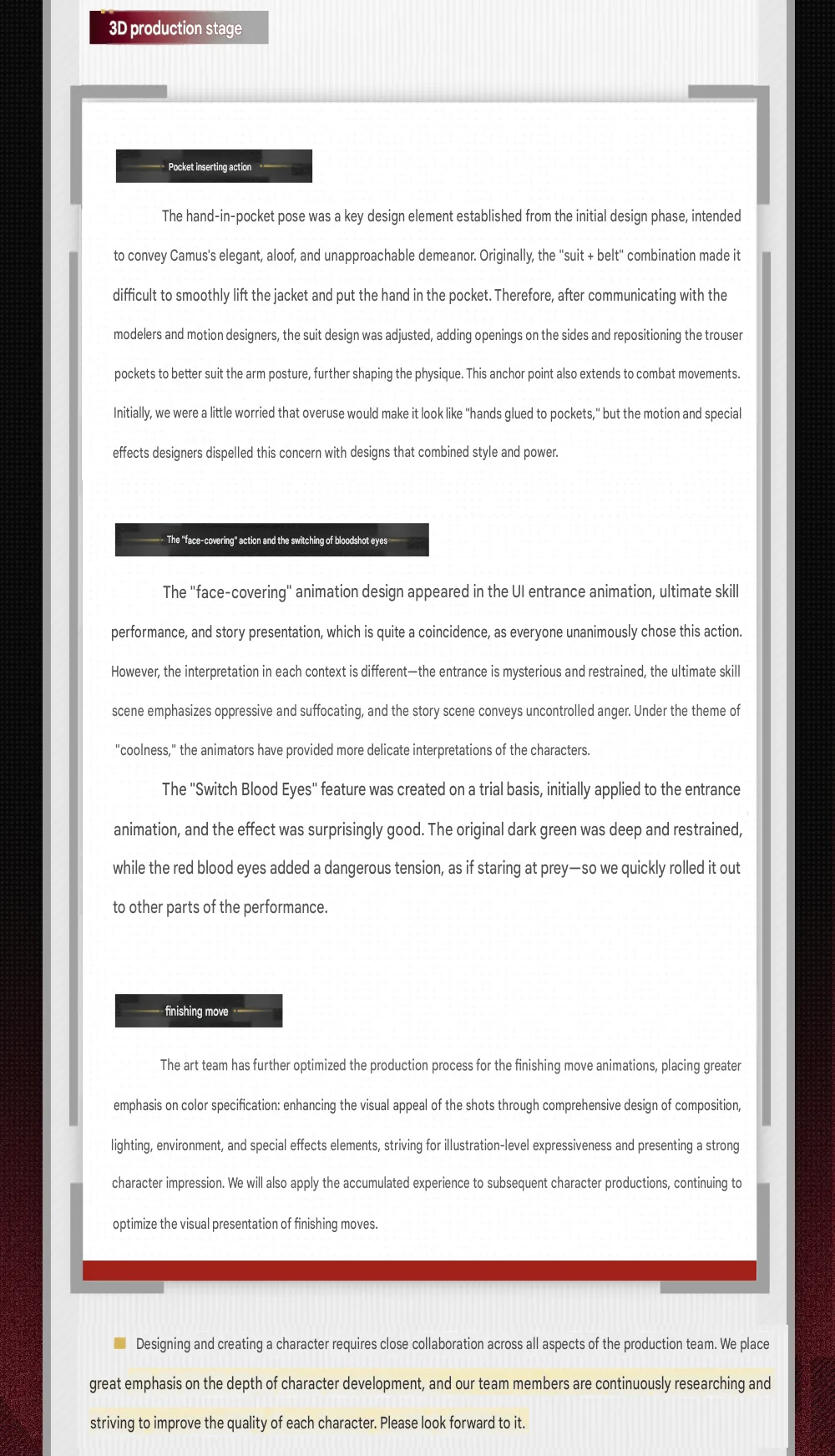
The 3D-production breakdown of the pocket pose, the face-covering gesture, and the “Switch Blood Eyes” trial.
“Coolness” as the production north star
If there is a single word the logs return to, it is “coolness.” The team frames it as the characteristic they most wanted to highlight, and they describe every department, modeling, animation, lighting, effects, pushing toward that one goal. The finishing-move work is where they went furthest, putting extra emphasis on color specification and treating composition, lighting, environment, and effects as a package aiming for “illustration-level expressiveness.”
The reason this is more than marketing fluff: the team explicitly says they will carry the accumulated finishing-move process into future characters. So the polish you see on Camille’s kill animations is being positioned as a new baseline, not a one-off. That is good news if you care about Endfield’s animation ceiling rising patch over patch.
Narrative design: from chasing a brother to being one
The narrative section reframes Camille in a way that recontextualizes his entire story quest. The team’s stated goal was for players to experience the plot from Camille’s perspective, not at arm’s length as an outside observer, and they poured effort into scenery, animation, music, and sound to sell that immersion.
The key admission is about how the story evolved. In the earliest version, Camille simply “chased after his brother” and rarely got to see what was actually happening around him. During production they rebuilt him to participate as a brother, experiencing the changing environment firsthand, so that by the end he is “not just Seš’qa’s caretaker, but also an older brother.” That is a meaningful tonal shift: it moves the arc from a manhunt to a reunion, and it explains why his quest plays more like grief than procedure. We broke down the canonical beats of that arc, including the family-photo reveal, in our Camille story quest analysis.
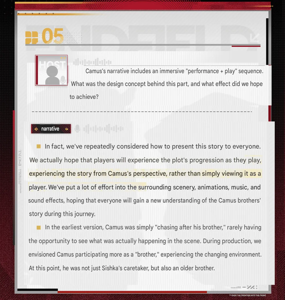
The narrative team on shifting Camille from a distant pursuer to a brother experiencing the story firsthand.
The Philip scene and the blossoming-vines Easter egg
Two production notes here are pure gold for lore readers.
First, the Philip encounter. Midway through the story, players meet “Philip” and have a conversation, and the team calls this their first attempt at a dramatic scene built to action-sequence standards: camera movement, animation, effects, lighting, music, and sound all pushed past their previous bar. They flag real difficulties too, including visual anomalies from mobile-device performance limits and the complexity of the camera work, which they solved collaboratively. Given that Philip is the in-story name for the brother Camille hunts, this is the cutscene the entire quest is built around.
Second, the Easter egg worth circling back for. When Camille first meets the iron frame he is sitting on, the vines around it bear no flowers. Return to that same spot after the story concludes and the vines have blossomed. The team built it because the first meeting and the farewell happen in the same location, and they wanted a subtle echo: flowers blooming to signal that things, after many trials, reach a happy ending, and that Camille and the Endministrator have gone from strangers to trusting each other. If you finished his quest and never walked back, that is your reason to.
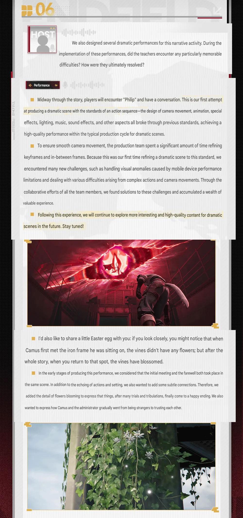
Top: the action-grade Philip cutscene. Bottom: the same iron frame’s vines, now in bloom after the story ends.
What this signals for future operators (Watch List)
Dev diaries are also roadmaps if you read them sideways. A few forward-looking signals stand out:
- A maturing male-character pipeline. The team lists prior work on Wolf Guard, Li Feng, Katchell, Alesh, Junwei, and the plot character Adashir as the groundwork that made Camille possible, citing the difficulty of generalizing bone structure for the “high blank space” male facial style. Expect male non-standard operators to keep arriving now that the tech is proven.
- Reusable flame-wing tech. “First wings in the project” plus an explicit combat-readability justification means the subsystem is likely to return on future flashy units.
- A rising finishing-move baseline. The team says the new color-and-composition process for kill animations will carry forward, so animation polish should trend up.
- More immersive, action-grade story scenes. They frame the Philip cutscene as a proof of concept they intend to build on, so expect more cinematic set pieces in upcoming story quests.
Common misreadings to avoid
A behind-the-scenes drop like this always generates a few confident takes that the source does not actually support. Worth correcting:
- “The wings were always part of his design.” No. The logs are explicit that he started wingless and the Bloodwing was a mid-production addition for combat reasons.
- “The neck tattoo is just flavor.” It is framed as a Seš’qa-bestowed sorcery mark that is “both honor and curse,” which is a deliberate lore statement about his bond and its cost.
- “Camus and Camille are different characters.” Same operator. “Camus” is the translated romanization; “Camille” is the English localization.
- “Philip is a new character.” Philip is the in-story name attached to the brother Camille pursues, the same figure our story coverage identifies as Char Arno.
- “Red eyes mean he’s enraged.” Not necessarily. The crimson-eye switch is reused across mysterious, oppressive, and angry contexts; it is a tension cue, not a single emotion.
How to use these logs by reader type
- Lore readers: the throat-mark and “older brother” reframing are your highest-value beats; pair them with the story quest breakdown for the full arc.
- Cutscene hunters: go back for the blossoming vines at the iron frame, and rewatch the Philip scene with the “action-sequence standards” framing in mind.
- Theorycrafters and gear nerds: the design notes do not change his numbers, but the “coolness over everything” thesis explains why his animations are long and showy; for the build math, stick with our Camille build guide.
- Roster planners deciding between banners: none of this is power-relevant, but if you are weighing him against his banner-mate, our Mi Fu vs Camille pull decision is the practical read.
Final read
The Camille dev logs are a clean example of Endfield’s “writing-first, visuals-downstream” pipeline working as intended. A one-line “Blood Demon Guardian” brief becomes a suit with a single antique key, a throat marked by a contract that is both honor and curse, a wound torn open to let vulnerability show, and a set of wings that did not exist until the team decided combat needed them. The animation language (hands in pockets, face covered, eyes flicking to red) all serves the same one-word goal of “coolness,” and the narrative team’s choice to make him a brother rather than a hunter is what turns his quest from a manhunt into a quiet tragedy.
The blossoming vines are the detail that sticks. It is the kind of optional, easy-to-miss touch that signals a team designing for the players who care enough to walk back. If the finishing-move polish and the action-grade cutscene standards really do carry forward, Camille will read as the moment Endfield’s character craft leveled up. Keep an eye on the next story quest to see whether that promise holds.
For how that design plays in combat, with his kit, stats and full profile records, see the Camille operator page.
Frequently Asked Questions
Are Camus and Camille the same character? Yes. “Camus” is how the community translation romanizes his Chinese name; “Camille” is the official English localization. They refer to the same Blood Hunter from Seš’qa.
Where do these dev logs come from? They are from Hypergryph’s “Sketches of Lost Heirlooms” developer-diary series, Part 3, covering Mi Fu and Camille. The English version circulating is a community translation of the Chinese original, surfaced on the Endfield subreddit.
Was Camille originally designed without wings? Yes. The early concept used fire bats forming bat-wing-shaped flames to support his spear. The full “Bloodwing” was added mid-production after the team agreed it would improve combat performance, and the logs call it the first set of wings the project ever built.
What do the marks on his neck mean? They are shaped on a Mobius angle combined with a spearhead motif and represent sorcery marks bestowed on him by Seš’qa as its caretaker. The team describes them as “both honor and curse,” reading as a thorn wrapped around his throat to signal an inescapable fate.
Why do Camille’s eyes turn red? A trial effect the team calls “Switch Blood Eyes.” His default dark-green eyes are restrained; flipping them to crimson adds a “staring at prey” tension that matched the Blood Demon brief, so they reused it across his entrance, ultimate, and story scenes.
What is the blossoming-vines Easter egg? The iron frame Camille first sits on has bare vines at the start of his story. Return to the spot after the story ends and the vines have flowered. The team added it because the first meeting and the farewell share that location, symbolizing a happy resolution and the growing trust between Camille and the Endministrator.
Who is Philip in Camille’s story? Philip is the in-story name of the brother Camille pursues, the same character identified elsewhere as Char Arno. His mid-story conversation scene was the team’s first cutscene built to action-sequence production standards.
Why does Camille keep his hand in his pocket? The hand-in-pocket pose was locked from the start to convey an elegant, aloof demeanor. It forced the team to redesign the suit with side openings and repositioned pockets so the gesture would animate smoothly.
Does any of this change his combat performance? No. The dev logs are about art, animation, and narrative design, not stats. For his kit, skills, and gear, see our dedicated build guide rather than reading power into the design notes.
Will future operators reuse Camille’s tech? Likely. The team frames the flame wings as the project’s first and the upgraded finishing-move process as something they will carry into future characters, so both the wing effects and the higher animation polish are positioned to return.
Take a Break
Available on desktop